Tuesday, 11 September 2012

Digital Art - "Hellgirl"


This is (unsurprisingly) another of my ImagineFX Forum weekly competition entries. Here's the brief of the competition:

Simple pencil sketch
Title: "Hellboy's Perfect Pin-up"

Brief: "Hellboy needs a girlfriend, a female equivalent, design his perfect companion."

Pretty straight forward! I started with a couple of rough pencil sketches till I came out with what you can see in the first image. I then photographed it and created a more refined digital line-drawing.

Before going on to do the proper colour, I decided to try adding very rough quick colour, just to make sure I was happy with it, and work out the lighting.

Early rough colour
Once that was complete, I did the usual steps of laying down flat colour in the background and working over the top of that in lighter or darker shades.

I was quite happy with the final illustration, but I wanted something of my own that wasn't based on someone else's ideas, so after the competition I re-worked the character into a more conventional and unspecific female adventurer (which you can see as the final image).

Final competition painting
Reworked 'original' character


All work is the © copyright of W.D.Lee and/or the respective companies, individuals or organisations to which the work is related. No infringement is intentional. No reproduction or copying is permitted without express permission.

Friday, 17 August 2012

Digital Art - "Varrish"


Initial Pencil Sketch
This is yet another of my ImagineFX Forum weekly competition entries. In this case. Here's the brief of the competition:

Title: "IFX Creature Design Cover"

Brief: "You have been asked to submit your design for the next creature design IFX cover. It must show at least the head and shoulders of the creature, looking at the viewer. Remember to leave space for any text with a generic comment. Include the IFX cover text in the font of your choosing. Please note this is just for fun and not an official cover challenge!"

B&W initial paint-over
I decided to use the competition as an excuse to also design a creature for the science fiction adventure book I am writing. I had already described this alien, so I just had to create it visually.

I did a pencil sketch of the front and side view of the creature, which I photographed, and then used as a rough guide to paint over. It was a fairly straight forward painting task, but for the competition I also added a vague futuristic background. In retrospect, I realised this detracted from the creature design, and it works much more effectively with a relatively plain background.

Final Design

All work is the © copyright of W.D.Lee and/or the respective companies, individuals or organisations to which the work is related. No infringement is intentional. No reproduction or copying is permitted without express permission.

Tuesday, 7 August 2012

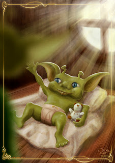
Digital Art - "Green Baby"


Yes, yes, I know it's been too long between posts. But I've finally returned to doing the Imagine FX magazine forum weekly competition, so here's the latest. Hopefully I'll have another for you later this week. Here are the details of the competition:

Here you can see
the rough sketch over
some early painting
Title: "Baby Boom"

Brief: "Depict the baby or youngling of a fantasy or sci-fi creature. It could be a mythological beast or more modern fantasy creature, or alien, it's up to you but it should make it's parents go "awww" (though not necessarily anyone else)"

I won't give you any more details about where my design came from, suffice to say it's the baby version of some other characters I hope to write a children's story about, one day in the future.

Here you can see most of
character is finished, but I
have yet to start the background
Anyway, onto the painting... I did a VERY quick sketch in pencil for this one. I didn't even bother scanning it, I just photographed it on my phone and took it into Photoshop (I know, lazy!).

I then simply painted over the top and added a few textures toward the end, to liven up things like the table and wall and an overall canvas texture to help that 'painted' feeling. Notice the baby looking up at the blurred silhouette of a parent in the foreground. I was quite happy with this painting, which only took a few hours overall.

Final Painting

All work is the © copyright of W.D.Lee and/or the respective companies, individuals or organisations to which the work is related. No infringement is intentional. No reproduction or copying is permitted without express permission.

Tuesday, 5 June 2012

Prometheus 2D (2012) - Cinema Review (7.5/10)

Frustrating
Ahh, Prometheus... Probably my most anticipated film of 2012 along with John Carter. Directed by the near-legendary director Ridley Scott, Prometheus is a prequel to his own film, Alien, from 1969. For those of you who don't know (although I don't know what rock you've been hiding under if you don't), Alien went on to become one of the most highly considered and influential science fiction films of all time.

In terms of Prometheus' relation to Alien, I'll try and give a little background. In Alien, A derelict alien spacecraft is discovered on a distant world, by a cargo crew who intercept what they think at first is a distress signal. It contains a terrible creature that goes on to decimate the crew. Really, there were two major elements in the film. The beast itself, and the mysterious alien vessel and race that it originated from. The film hints, but never states, that the creature was potentially a biological weapon of the race to whom the derelict belonged.
As anyone who hasn't been in cryogenic freeze for the past forty odd years will know, it spawned a host of sequels and associated films that dealt only with the creature, yet strangely eschewed the mystery of its origin.
Ridley Scott has finally decided to pick up that unused thread of the story with Prometheus, almost completely separating it from the eponymous creature of the other films.

I've been a fan of Alien and its sequels for many years, but I always wanted to see someone make a film dealing with that mystery. So I was over the moon when Ridley decided to return to the franchise.

The question then becomes, how well did he succeed? This is where it becomes frustrating. Prometheus is both simultaneously excellent and disappointing at the same time. Often the flaws in these kind of films come about from destroying the mystery of what went before. Oddly enough, that isn't where Prometheus goes wrong. If anything, that's where it succeeds, only to be maddeningly undermined by the most basic of elements that should have been the easiest. I'll warn you now, in order to cover these my review will contain spoilers, so read no further if you don't want to ruin the film for yourself.

Prometheus is a film that relies very much in its earlier stages on that old horror movie stalwart; 'characters do something stupid to get them into a situation'. The worst example is when two characters get lost in a series of underground corridors, when one of them was in fact the individual responsible for knowing how to map the area in the first place. Then those two characters are not only conveniently forgotten by the ship's crew during an evacuation, but they seem to forget about contacting the ship themselves, until such time as they can be conveniently 'lost'. So once we get past that... where do those two characters go? Just the very location they chose to avoid earlier.

The reason they left the main party and got lost, was because they had the sense to decide to try and return to the main ship early, rather than progressing into an unknown area with the foolish and irresponsible scientists. So for no real reason they decide to hole up in that very area the scientists opened up, when they are stuck for the night in the abandoned underground chambers. Of course it doesn't end there. A character scared enough to not enter this room earlier, is now quite happy to try and interact with an alien beast displaying characteristics suspiciously close to that of a cobra. Of course this results in a rather unhappy conclusion for the poor fellow.

All the while this top-of-the-line absurdly expensive exploration mission leaves no-one monitoring events while two of their crew are stuck alone in an alien environment, so that their fates are not only missed but seemingly unrecorded in a situation where surely everything would be recorded.

Then of course we have the old 'The air is breathable so let's take our helmets off' situation, without testing it in some manner first.

We also have a character deliberately infected with something that could have potentially endangered everybody, despite the fact that such an act was clearly sanctioned by someone who also wants any opportunity to survive and live forever.

Later, one of the best scenes is also one of the most annoying. I'll try not to give too much away, suffice to say a character has to perform a self-inflicted operation in order to save themselves from a creature. It's tense, disgusting, nail-biting stuff. Unfortunately it is accompanied by some sheer idiocy. The character reaches this situation after escaping two others who seemingly forget her actions and then leave her to perform all of this without interruption. Not only that, but no-one else on board seems to be alerted to this drastic situation and the thing it leaves on board, except for a slightly unconcerned acknowledgement by the android character. Is any of this making sense?

We also have a selection of characters that are poorly introduced. The original Alien is a master-class in the introduction of varied and distinct characters, partly through script, partly through direction and editing and partly through excellent actors. Prometheus manages this with a small handful of the characters, while leaving others practically skimmed over but later used in such a way as to imply we should have known and cared for them.

Meanwhile the most interesting character in the whole film (with the possible exception of the android), is wasted. Meredith Vickers, played by Charlize Theron (Aeon Flux, Snow White and the Huntsman), is kept alive until the final reel where you hope something will happen, and then simply disposed of in an all-too-convenient way without any purpose. In fact there are a few elements like that in the film. Things with potential, that are just conveniently forgotten or discarded.

What is good, you may ask? As always, Ridley Scott can produce the most visually impressive films. There is little doubting that Prometheus looks superb, even if some of that is due to the ideas and designs that go all the way back to Alien. The soundtrack is also quite enjoyable, though I can't say particularly memorable. Ridley clearly wanted to distance himself from the 'horror movie/haunted house' feel of the original Alien soundtrack. In fact this distancing is a 'theme', if you can call it that, throughout the film. It does not have the expected trademark 'darkness' you would expect it to easily have. He has not tried to create a straight forward horror film atmosphere, which goes some way to making the film feel atmospherically less predictable than it unfortunately ends up being.

The overall themes and ideas involved are what save the film from being a complete mess. The somewhat unresolved mystery of the 'spacejockey' creatures (as the mummified spacecraft pilot of the original film came to be known) keeps things interesting. Enough is revealed (or at least confirmed for fans) to keep it satisfying, whilst keeping and even introducing new mysteries. The ending for the lead character Elizabeth Shaw, played by Noomi Rapace (The Girl with the Dragon Tattoo), is sufficiently different and fun (even if her character is one of the least interesting), whilst the very end sets up a nice lead into the original film, albeit perhaps being a little too on-the-nose.

If I was only thinking of the themes and general ideas in the story, I would say this was an excellent prequel to Alien. It's just a shame that it was let down by the otherwise more conventional aspects of the story that Ridley Scott has himself done so much better in the past.

Be prepared... For many, my next few comments will verge on sacrilegious. Oddly enough, the film's general themes have a lot in common with the much derided first Aliens versus Predator film. While Prometheus has a much more serious and refined feel, it surprisingly doesn't succeed as well in some areas. For example, Prometheus obligatory powerful billionaire character is in fact more stereotypical and less interesting than his own presumed ancestor in AVP. Likewise, while itself flawed in places, AVP suffers from fewer occasions of 'stupid person does stupid thing' to move the plot along. It's difficult to admit, but I think AVP also did a better job of introducing its characters and making us care about them.

I think Prometheus can be boiled down to three levels. Firstly, the main themes and ideas, secondly the overall script and characters, and lastly the visual feel, from the production design to the direction. The production design and direction are superb, at the top level. The main themes and ideas are excellent if not especially original or expanded. The script and characters veer between good to downright badly thought out, saved only by excellent actors and direction.

If I could sum up the whole film in one word, it would be 'frustrating'. What makes it so frustrating, is that the weaker parts were those that so easily should have been right, while the elements that could have easily gone wrong were actually quite successful. It could have been a great film and is instead more of a fascinating failure.

I'm still giving it a relatively high mark, because even as somewhat of a failure, Prometheus is an excellent film in comparison to most. It works on most levels, has some wonderful and thought provoking ideas (even if only in relation to its own universe), and looks superb. It's just a shame it fell flat with so many of the basics.


7.5/10


All work is the © copyright of W.D.Lee and/or the respective companies, individuals or organisations to which the work is related. No infringement is intentional. No reproduction or copying is permitted without express permission.

Thursday, 3 May 2012

Digital Art - "Rocket Girl"


Initial digital sketch
This is another of my entries for the Imagine FX magazine forum weekly competition. I did this quite a few weeks ago, but have neglected to upload here to my blog, so I thought it was about time I did. And for those interested, this will be my 100th blog post!

Title: "Rocketgirl Rita - a 50s' Sci-fi  pinup"

Description: "Rocketgirl Rita is a 50's pin up - she is renowned for being THE ultimate Sci-fi pin up"

Brief: "Depict Rita in all her 50's sci-fi glory - include as many cliche's as you wish!"

Refined line drawing
This painting was done completely in Photoshop, with no scanned pencil sketches or similar. I started off with the idea of having four separate mini paintings of the character in various action poses, one in each corner, but unfortunately I realised I didn't have time.

The painting was completed over two evenings, firstly on the initial sketch and refining that to a sharp line drawing, and then adding colour and shading. When it came to painting the character, I used soft round brushes for speed, as they blend easily. Normally I avoid using them, because they tend to give digital paintings a cheap 'artificial' look, but I decided to risk it for the speed advantage.

With flat colour
To mitigate this, I used textures to break up the artificial 'smoothness' of the character's skin and clothing. In order to really push the old poster feel, I also utilised a folded paper texture I had created some time ago for another painting (The WWII Power Suits, for those interested).

With initial shading


This final version is slightly modified from the final I did for the competition, as afterwards I decided to modify a few elements. Namely, instead of keeping a texture on the 'moon', I left it with flat colour, to help the character stand out. Other than that, I merely touched up a few colours and minor details.

I was fairly satisfied with the final painting, considering how quickly it was done, and I hope you enjoy it too!

Final Painting

All work is the © copyright of W.D.Lee and/or the respective companies, individuals or organisations to which the work is related. No infringement is intentional. No reproduction or copying is permitted without express permission.

Saturday, 31 March 2012

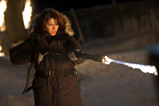
The Thing (Prequel - 2011) - Home Cinema Review (6.5/10)

Hey, Sweden!

Although the name has been left confusingly the same, this 2011 version of 'The Thing' is in fact a 'prequel' to the 1982 film 'The Thing'. Firstly, I'll state that I'm a big fan of the original. In fact, it's high in my top ten films of all time, equal to 'Alien'. When I first heard they were creating a prequel, I'll admit I was disappointed they weren't giving John Carpenter (Director of the original) a chance to create the sequel he'd always wanted to, but I wasn't averse to the idea of a prequel either.

Both films are set in 1982, Antarctica. A Norwegian research base has discovered an ancient spacecraft buried deep under the ice for as long as 100,000 years, along with the corpse of a creature that froze to death trying to escape the wreckage. They make the mistake of digging it up...

In the original film, the events at the Norwegian camp serve as off-screen back story. They enhance the mystery because the main characters see the results of what happened, without yet knowing why. The prequel tells the tale from the Norwegian camp, leading up to the original film.

Setting aside plot holes and contradictions and general film flaws for a moment, I found the biggest problem with the prequel is that it adds almost nothing to the story. Prequels by definition aren't necessary (since whatever story they're linked to obviously functioned before their existence), but if you're going to make them, you may as well truly add to the world they exist in. Regardless of what you think of the 'Star Wars' prequels, for example, there's no denying they add to the mythology of that universe. 'The Thing' is clearly not set in such an expansive realm, but there is more than enough room to grow the story. This film commits the sin of having that opportunity and not taking it. The only 'new' element is an interesting alternative to the 'blood test' scene from the original film. We do see inside the alien craft this time, but it is done in such a way as to add no information for the viewer, thus rendering it fun but pointless.

So what about the film in general? The acting is actually good. Unfortunately the script and direction gives the cast little to work with. The original film takes a team of several men, and over the course of the film each has a distinct and individual personality, partly through script, partly through direction, partly through picking a range of wonderful character actors. The prequel fails by not defining any of them in detail.

The lead character, played by Mary Elizabeth Winstead (Die Hard 4.0, Final Destination 3) fares the best, but what little definition her character has, can be attributed to her acting and not the script. The film jumps into the 'horror' side of the story far too quickly, cutting out time to establish the other characters, with the possible exception of the lead scientist who plays a part reminiscent of his parallel in the first B&W version of the story, 'The Thing from Another World'.

All-in-all it feels like a film on fast forward. It lacks the atmosphere or tension of the original film precisely because it does not spend time setting up the horror moments. Instead they just 'happen', and we are expected to be scared because of 'gory creature'. The original film worked so well, because it was really about the fear of isolation and the paranoia of not knowing who you could trust. The horror, superb as it was, merely emphasised this. The prequel is robbed of any such moments. You never feel isolated and lonely, and you never have time to join the characters in worrying who is a creature and who isn't, before the next one is revealed.

The story never seems to know whether it wants to be a prequel, a homage or a remake. Sometimes things are introduced as if we should have the prior knowledge of the original (which alienates new viewers). Other moments are directly copied from the original in such a way as to imply a remake.

As for the creature effects themselves, we have another problem. The original is seen as a landmark in practical horror effects, that stand the test of time. They are beautiful and repulsive, created practically and filmed on-set. For the most part they feel utterly real, and even when they aren't perfect (though pretty damn close), they still work because the things were actual physical props dripping in fluids and tearing apart in front of our eyes.

The new film instead uses CGI effects, which while excellently done, stand out as CGI effects. This isn't a fault of the budget or the people who created them, it's simply a problem with modern CGI. It can do a great many things, but it still cannot recreate blood and gore and flesh as effectively as traditional effects. As a result, the creatures are never actually creepy or unnerving because the feeling in our gut tells us they aren't really there. It seems strange to think that in another twenty or thirty years, people will watch the original film and still feel that sick revulsion in their stomach at the realistic horror of the beast's transformations, while the modern big-budget film will look terribly fake.

Strangely enough, the sound is also a problem on the prequel. The original had screaming creature sounds that genuinely sent a shiver down the spine. The new film could have used the same sounds, but, apart from the occasional use, resorts to creating new ones that simply aren't as effective.

The musical soundtrack is also a disappointment. It's not bad, having been composed by Marco Beltrami, veteran of many a good film soundtrack (including a lot of horror films). Unfortunately the original film once again had an iconic and incredibly atmospheric score by veteran composer Ennio Morricone (Heavily influenced by the film's director, John Carpenter, who often creates his own scores), that Beltrami never matches. I don't like to criticise Beltrami, because I like a great deal of his other soundtracks, but I suspect he was told to create something different for the film, rather than emulate the original. It's just a shame that by doing so, it lacks the sombre and moody atmosphere it could have had.

Then we come to the continuity. This really is a head-scratcher. On the one hand we have a film that appears to go out of its way to carefully link itself to the original. For example, when the characters visit the burnt-out Norwegian camp in the original film, they find bodies and items in the camp that the prequel goes to great bother setting up. Then we have an absurd and glaring plot-hole. (Please stop reading if you want to avoid spoilers). The creature at the end of the prequel, escapes to the buried spaceship and by starting the engines, melts the ice above it. This creates two problems. One, the first film establishes with video footage that the Norwegian crew used Thermite charges to melt the ice above the buried craft, and reveal its surface. Two, if the crashed ship was still capable of flight, why did the creature not race to it earlier and why did it even leave the craft 100,000 years ago to freeze in the ice, instead of just taking off again? It makes no sense, especially in light of the efforts made to match continuity in other areas.

Finally, I shall comment on the direction. John Carpenter, director of the original film, had an unmistakeable style that suited the building of tension and atmosphere, having already made classic films such as the original 'Halloween' and 'Escape from New York'. The prequel, while functional, never gives us anything that stands out. There are moments in the original where just the composition of a shot can create a wonderful sense of foreboding, or character, or story. This new film seems to suffer from a problem symptomatic of many recent movies, where the directors and/or editors appear afraid to linger on any one shot. Unfortunately it is usually such carefully composed shots that create tangible atmosphere.

I've spent a lot of time outlining the problems with the film, so it may come as a surprise when I say I didn't hate it. In comparison to many recent horror movies it is surprisingly not bad, and even quite effective during its middle portion, between a rushed beginning and a muddled finale. Its problems occur when compared to the original, which still towers far above it. The new film has many, many problems, but when taken on its own, it is an enjoyable enough experience. Over all, I think it is not unlike 'Predators'. A film that takes so many of its best moments from its progenitor but adds so little, that it becomes ultimately pointless. It serves simply as a reminder of how great the original was and makes you want to go back and watch that. It's a shame, as it could have been so much more.

6.5/10


All work is the © copyright of W.D.Lee and/or the respective companies, individuals or organisations to which the work is related. No infringement is intentional. No reproduction or copying is permitted without express permission.

Friday, 16 March 2012

Digital Art - "Waking Mars" and "Pendragon"


I thought it was about time I added a bit more artwork, and although these two piece are at least a good few weeks old now, I realised I hand't posted them, so here goes...

As usual, these were entries for the Imagine FX magazine forum weekly competition.

Waking Mars
'Work In Progress' illustration 1
Title: "Waking Mars"

Description: "The year is 2050 and man is exploring the caverns on Mars. The expedition is run by The United Earth organisation who has spent billions on attaining the rights to any resources in this sector. During a routine mapping expedition, one of their survey teams stumbles across something unexpected. An hibernating dragon - now awakened by their presence, it is hungry and deadly."

'Work In Progress' illustration 2
Brief: "Create a Movie Poster for "Waking Mars" which displays the moment of discovery/awakening. Both dragon and human(s) need to be included in the composition, as well as the United Earth branding/logo."

I didn't leave myself enough time to finish this one properly for the competition, however, below you will see my final refined version.

In order to create it quickly, I drew it traditionally in pencil, then went over in ink and marker. Once scanned, I coloured it in Photoshop and added plenty of textures to bring it to life.

'Waking Mars' Final
I also wanted to give it an old movie poster feel, so as you will see, I've overlaid one of my own paper textures (if you remember the WWII Power Suit competition, you'll see when I originally created a few). The paper texture is all creased and folded and helps to give it the look as if it's been left in a drawer for a few years.

It's far from perfect, but it was a good experiment at how you can use colour, texture and light along with a few other little tricks, to bring life to something that was really quite quick and rough.


Pendragon

'Work In Progress' illustration 1
Next we have: "The Pendragon Castle of Camelot"

Description: "Depict a Pendragon Castle of Camelot."

Brief: "The castle can be anything from Fantasy style to historically accurate Roman constructions."

'Work In Progress' illustration 2
This one was created purely in Photoshop. No scanned drawings, only a couple of quick pencil sketches to get the layout straight in my head. I also wanted to experiment more with using Photoshop brushes that have a canvas texture, to see how it affected the overall look and style.

It's not brilliant, and I hate how poorly the towers and city came out, but I'm quite happy with the other elements.

'Pendragon' Final

I hope you enjoy these two new paintings!


All work is the © copyright of W.D.Lee and/or the respective companies, individuals or organisations to which the work is related. No infringement is intentional. No reproduction or copying is permitted without express permission.